Xbar R Chart
The Xbar R chart is a control chart for continuous data with a constant subgroup size between two and ten.
- The Xbar chart plots the average of a subgroup as a data point.
- The R chart plots the difference between the highest and lowest values within a subgroup as a data point.
The Xbar chart monitors the process mean and the R chart monitors the variation within subgroups. The Xbar is valid only if the R chart is in control.
The underlying distribution of the Xbar-R chart is normal distribution.
Xbar Chart Equations
Xbar chart
Data Point: 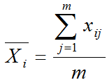
Center Line: 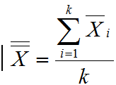
Control Limits: ![]()
Where:
- m is the subgroup size
- k is the number of subgroups
A2 is a constant depending on the subgroup size.
R Chart Equations
R chart (Rage Chart)
Data Point:
Center Line: ![]()
Upper Control Limit: ![]()
Lower Control Limit: ![]()
Where:
- m is the subgroup size and k is the number of subgroups
- D3 and D4 are constants depending on the subgroup size
Use Minitab to Plot Xbar R Charts
Data File: “Xbar-R” tab in “Sample Data.xlsx”
Steps to plot Xbar-R charts in Minitab:
- Click Stat → Control Charts → Variable Charts for Subgroups → Xbar-R.
- A new window named “Xbar-RChart” appears.
- Click in the blank box right below “All observations for a chart are in one column” and the variables appear in the list box on the left.
- Select the “Measurement” into the box below “All observations for a chart are in one column.”
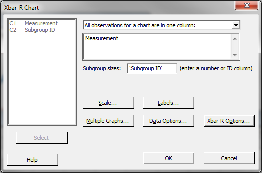
- Select the “Subgroup ID” as the “Subgroup size (enter a number or ID column).
- Click “Xbar-ROptions” button and a new window “Xbar-R Chart – Options” appears.
- Click on the tab “Tests.”
- Select the item “Perform all tests for special causes” in the dropdown menu.
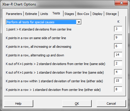
- Click “OK” in the window “Xbar-RChart – Options.”
- Click “OK.”
- The Xbar-Rcharts appear in the newly-generated window.
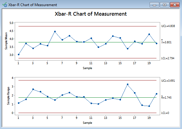
Xbar-R Charts Diagnosis
Model summary: Since the R chart is in control, the Xbar chart is valid. In both charts, there are not any data points failing any tests for special causes (i.e., all the data points fall between the control limits and spread around the center line with a random pattern). We conclude that the process is in control.


Comments are closed.